Behind the Scenes of an Yvorine Project: From Brief to Launch, Creative Decisions and Trade-offs.
We’ve often been asked, “How does Yvorine actually work?”
Rather than simply listing our services, we’ve chosen to share an inside look at a project. What follows is a detailed account of a recent collaboration with a Parisian fine jewelry house—whose name we’re keeping confidential, in keeping with our ethical standards—to completely overhaul its digital presence. From the first meeting to the final launch, here’s how we work. And above all, why we work this way.
The Brief: Between Ambition and Contradiction
The company approached us with a simple yet painful realization: its website—despite having been redesigned two years earlier by a reputable digital agency—wasn’t “doing the pieces justice.” The photographs were beautiful. The interface was functional. But something was missing. The site looked more like an online catalog than a jewelry house. It showcased the products without conveying any emotion.
The initial brief called for a “visual overhaul.” After three hours of discussion with the agency’s art director and CEO, we realized the problem ran deeper. It wasn’t the website that was the issue. It was the way the agency approached its digital presence. It viewed the web as a distribution channel, when it should have been an experiential space.
We don’t just redesign websites. We translate worlds into a digital language. The distinction is fundamental.
Phase 1: Immersion
Duration : 3 weeks
Before touching a single pixel, we spent three weeks getting to know the brand. Not through briefs or PowerPoint presentations, but by immersing ourselves directly in the experience. We visited the workshop and watched the artisans at work. We attended client meetings in the store. We studied the archives—catalogs from the 1960s, the founder’s correspondence, and photographs of historic store windows.
This immersion phase is non-negotiable in our process. It is also the phase most misunderstood by clients who expect quick results. But it is this phase that makes all the difference. Because in the luxury sector, digital isn’t about technology. It’s about authenticity. If you don’t have a deep understanding of what makes a brand unique, you’ll never be able to convey that on a screen.
From this immersion, we distilled what we call the “sensory landscape” of the house: the recurring words in the artisans’ speech, the gestures that define their craftsmanship, the dominant colors of the workshop, the very sound of the environment—the clinking of tools, the focused silence of the gem-setters. All of this informed the creative direction.
Phase 2: Artistic Direction
Duration : 4 weeks
We developed three comprehensive creative concepts, each accompanied by a mood board, a color palette, a typography guide, a homepage prototype, and a two-page concept note explaining our design choices.
The first major decision concerned the background color. The existing site used pure white, the default choice for most luxury websites. We proposed a lightly tinted background, somewhere between greige and ivory, inspired by the color of the tissue paper used in-store to wrap jewelry boxes. This seemingly minor detail transformed the entire perception: the jewelry was no longer “displayed on a screen” but “placed in a box.”
The second decision concerned the typography. The brand used a modern sans-serif font—clean but generic. We proposed a classic serif font, a reworked Garamond, for the headings, paired with a thin sans-serif for the body text. This contrast conveyed something essential about the brand: a grounding in tradition, combined with modern readability.
The third decision, the most significant, concerned navigation. The existing site was organized by product categories: rings, necklaces, bracelets, watches. We proposed navigation by theme: the collections, the workshop, the gemstones, special orders, the brand. This is not a minor ergonomic detail. It is a paradigm shift. The customer no longer comes to “buy a necklace.” They enter a world.
Phase 3: Production
Duration : 8 weeks
Website development, creation of photographic and editorial content, and integration of the in-store appointment system and the special orders module.
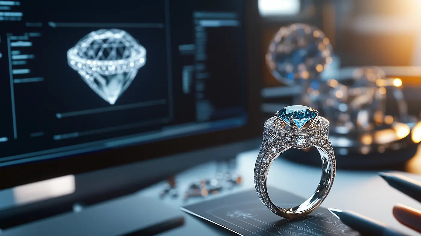
We made a decision that surprised the client: to recommend a complete reshoot of all the pieces. The existing photographs were technically excellent, but they had been designed for a catalog, not for a digital experience. The difference is subtle but crucial. A catalog photo shows a piece of jewelry. An experiential photo conveys what it feels like to wear it.
We worked with a photographer specializing in jewelry, asking him to break away from the conventions of the genre. Rather than close-ups against a neutral background, we opted for intimate scenes: a ring resting on a hand turning the pages of a book. A necklace captured in the light of a late afternoon. Images that tell a story of a life, not just an object.
For the copy, we abandoned the usual descriptive tone—“18-karat white gold, set with 47 round diamonds”—in favor of a literary style. Each collection received an introductory text that evoked its inspiration, its history, its emotion. The technical specifications remained available, but took a back seat. Emotion first. Information second.
The result and what it taught us
Six months after the launch, the metrics spoke for themselves. The average time spent on the site had tripled. Requests for in-store appointments had increased by 40%. And most importantly—the statistic that stood out the most to us—customers in-store were spontaneously mentioning the site in their conversations with sales associates. “I saw on your website…,” “The story behind this collection really moved me…” Digital was no longer a separate channel. It was part of the brand experience.
This project has reinforced a belief that guides all our work: in the luxury sector, digital isn’t a technical issue. It’s a matter of translation. It’s about taking a world that exists through touch, scent, and the lighting of a boutique, and finding ways to bring it to life on a six-inch screen.
It’s a huge challenge. It’s also the most wonderful creative challenge of our time
This article marks the launch of the “Atelier” section of Yvorine Magazine, a space dedicated to behind-the-scenes insights, creative processes, and sharing the stories behind Yvorine’s creations.